Is it time to change the club’s crest?
It’s a question that’s come up a lot over the years. And it resurfaced again on one of our shows recently, sparking another round of what seems to now be a yearly debate.
It’s important to mention that changing the badge isn’t in the club’s immediate plans – that we know of. But more than 40% of the 1,348 people that voted in our Twitter poll last week said it’s time for a rebrand.
And never shy of wading in, some of the Wise Men Say family have now shared their opinions on the topic. Here’s what they had to say.
Joe Owens – Stick With What We’ve Got
The Stadium of Light opened when I was four. I went to Roker Park, but I have no memories of its hallowed turf. There’s no connection for me, other than a few nice photos and a painting on my wall passed on by my Grandad.
The Stadium, meanwhile, is all I’ve known. It’s been the home of Sunderland as my love for the club has grown. It’s been the constant when other parts of my life have been absent.
And to me, the crest is synonymous with that. They were created in unison, and all across the ground, the robust mixture of corrugated steel and concrete is adorned with our club’s badge. It’s the centrepiece of the East Stand. It’s the last thing you glimpse at in the mirror before you walk out your front door and head to the match.
I don’t live in the North East anymore. But when I see our crest, it reminds me of everything that’s amazing about Sunderland. Its history and architecture through Penshaw Monument and the Wearmouth Bridge. The mining wheel, representing the hard-working, no-nonsense people of the city and the ground on which the Stadium sits. The lions, portraying the incredible people of Sunderland. And, of course, the famous red and white stripes which we all know and love (most of the time).
In my mind, there’s no other crest that could better represent the meaning and complexity of Sunderland Association Football Club. And that’s why, and this’ll be the case every time this question gets asked, we should stick with what we’ve got.
Stephen Goldsmith: Time To Change It
It is nigh on quarter of a century since Sunderland changed their crest. Rebranding is not something people should fear, it’s perfectly natural.
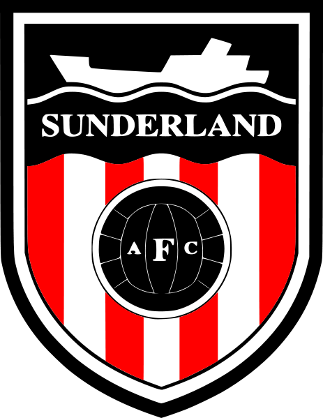
In most cases rebrands are slight, subtle and true to the roots and history of the very thing it represents. I get that this is Sunderland AFC, not some poxy franchise that needs to reinvent itself constantly, I agree with that. I remember the proper kick offs in 1997 when Sunderland ditched the ship badge (and that is still most peoples’ favourite) and totally changed it; they didn’t tweak it or evolve it, they thought a new dawn required a new badge.
Well they’ve left us in this predicament now, haven’t they, because you can’t merely evolve or adapt something that pinpoints so accurately to a specific era. Do people want us to have this crest forever and ever? Think about how ridiculous that sounds. Somebody, in one, five, ten or fifty years, will change the club crest, and I guarantee that the new design will be something that can be slightly tweaked and evolved as the decades go by.
But the current badge is of a specific era without compromise.
Now, living as a teenager in the 90’s was mint. It was a decade of hope and change, everyone became more liberal, more accepting and football exploded in popularity to the point they actually put it on the TV, on one of the many, many TV channels we suddenly had. There was Britpop and an explosion of Indie music, now that WAS stylish. But in terms of badge design, we didn’t get Oasis or Blur, we got Hootie and the Blowfish. All of the good football designs from the 90’s, Hummel kits and the like, were left over from the 80’s. Then then the 90’s put its stamp on things and made it worse. Look back at photos of people’s wallpaper, white jeans, baggy shirts and undercut curtain hairstyles.
The 90’s, a brilliant decade for society and popular culture, absolutely shocking for designing football badges.
Take off your SAFC rose-tinted spectacles and just look at it. It’s clunky, busy and outdated. It is Grandad, I’m sorry but it is. What do you like about it? Go on, tell me? The ribbon, the crest, the Latin and the lions are cliché 1990’s badge design.
Leeds and Man City have been grown up enough to admit their mistakes and sort it out, and we should do the same. I know some of you are used to it now and don’t like change, blah blah, but this more than ever feels like a new start at Sunderland and we should change this crest NOW.
More than ever, there is a desire to recapture tradition with new design. If you can find a way to include some bits of this one then great, Penshaw monnas or the mining wheel or something, but take a look at the evolution of Man City’s badge and admit how their late 90’s monstrosity stands out like a sore thumb. If we went back to a reinvention of our crest from the 80’s and early 90’s, ours would do the same.
Evolve the old ship badge and be done with it.
What do you think? Let us know on social media!


