We’ve all got our favourite Sunderland home kit. Whether it’s one that we’ve won something in, or it’s the kit we wore when you went to your first match, or it’s just, well, the perfect kit, we all have differing opinions.
But instead of making this a simple ‘what’s your favourite kit’ piece, we decided to overly complicate things and open it up to a vote within the wider WMS team, awarding points for first choice, second choice, third choice and a wildcard, which is basically fourth choice.
Did we need to do this? No, not really. Are we regretting it? Actually, yes, a little bit. Are we happy with the results? Surprisingly, yes.
So, 20 points are awarded to the first choice, 15 points for second, 10 points for third, 5 points for the wildcard. Add them all together, and we’re left with our winners.
First of all, though, let’s go through a few of our choices before we do the final rundown.
If you’re bored now, you’ll be delighted to know we’ve done exactly the same for the away kits too.
There’s a bonus companion podcast for the home kits and the away kits on our Patreon site, so if you want to hear us blather on about the ‘correct’ Pantone shade of red, boy are you in for a treat.
RICHARD EASTERBROOK
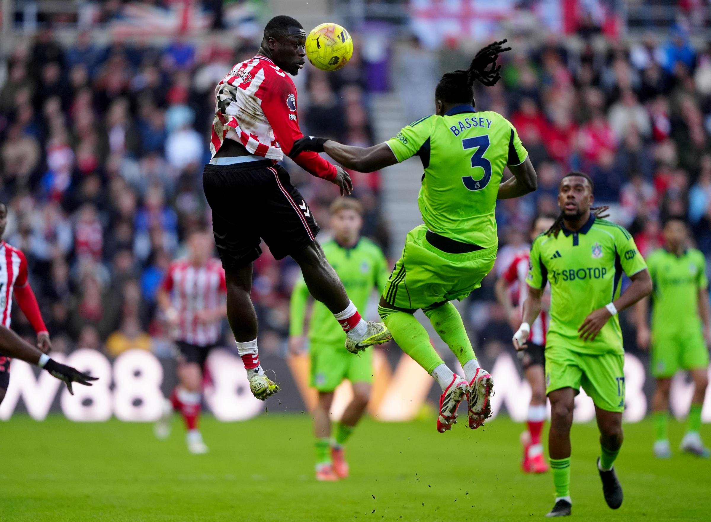
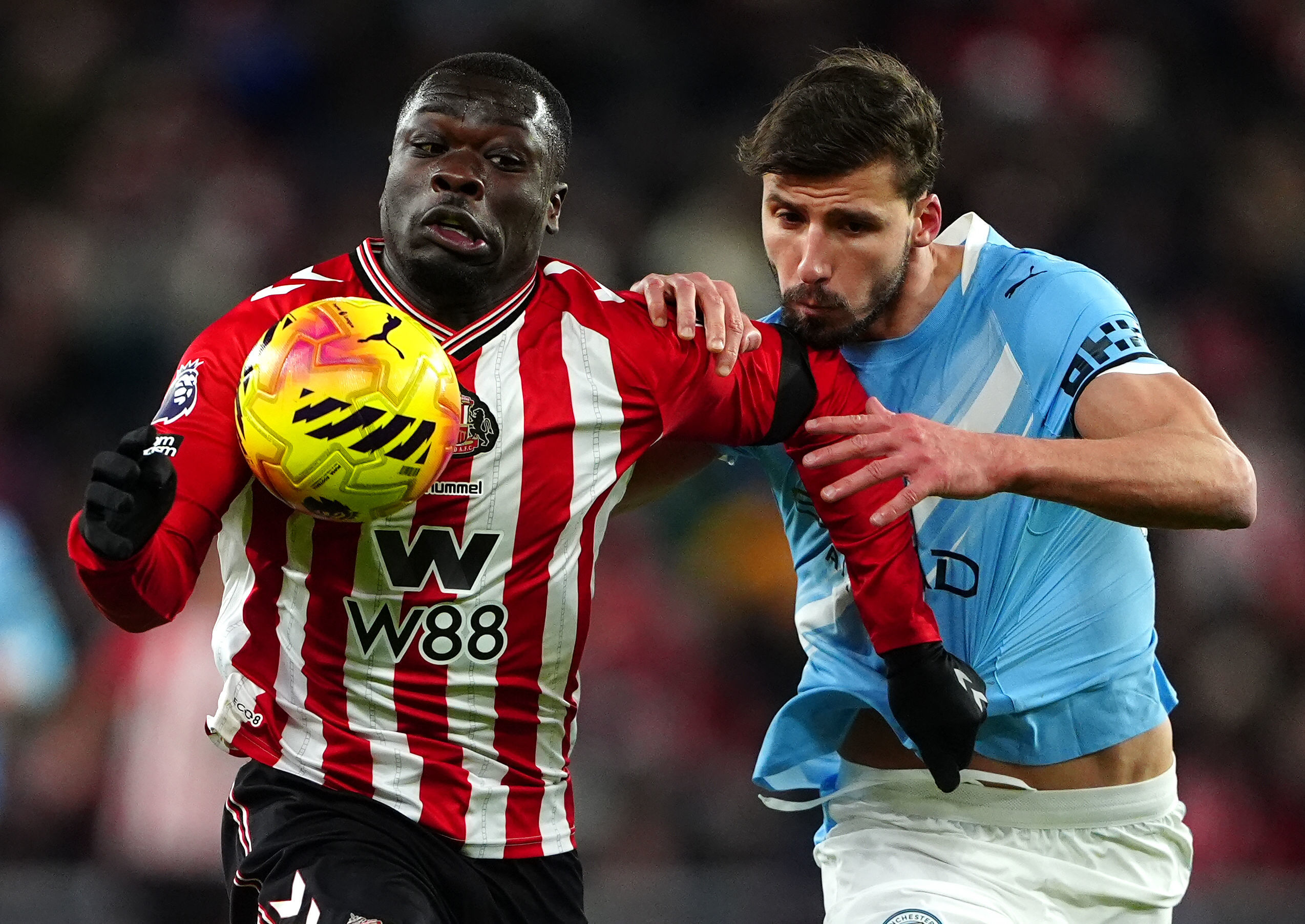
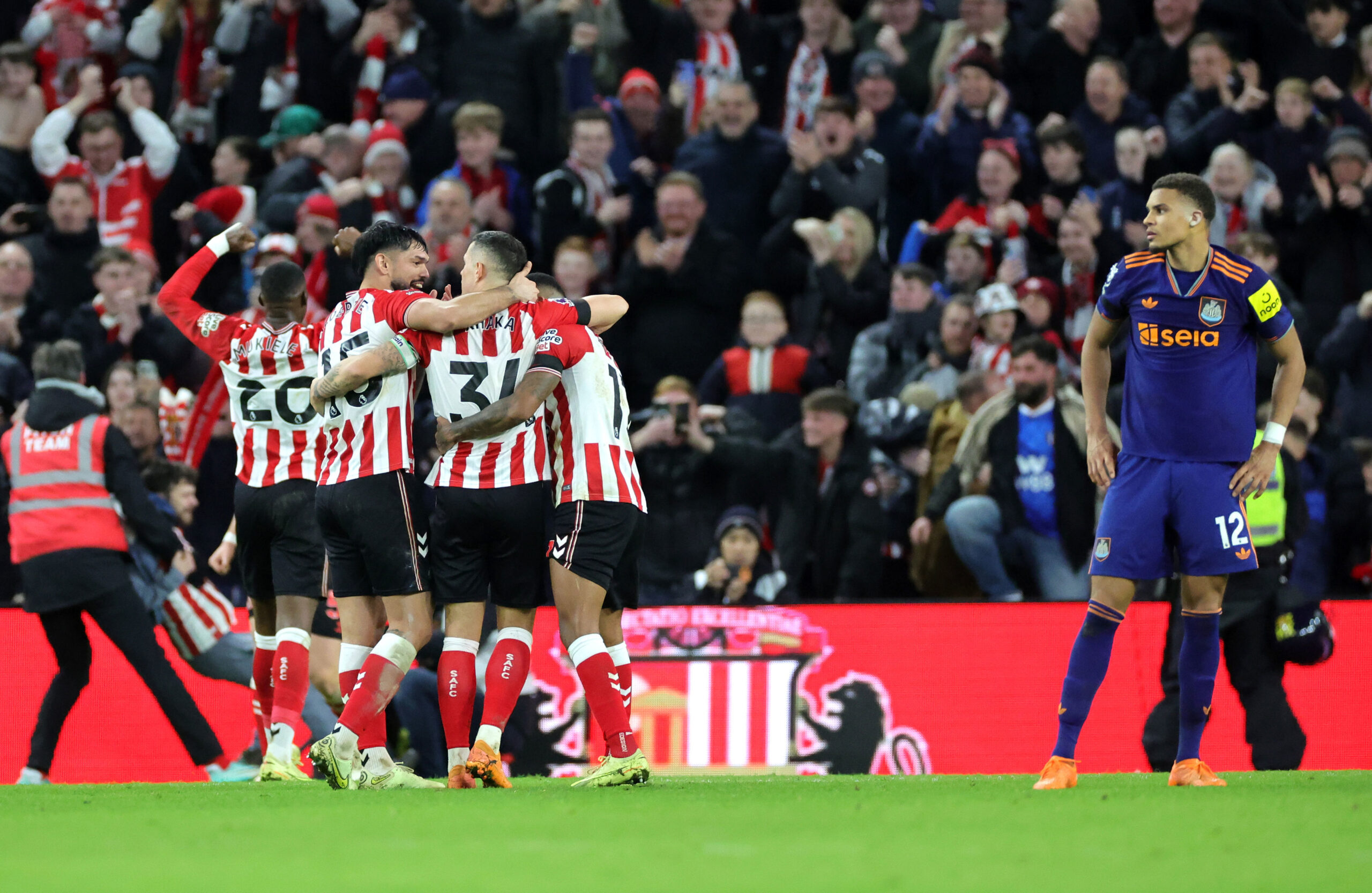
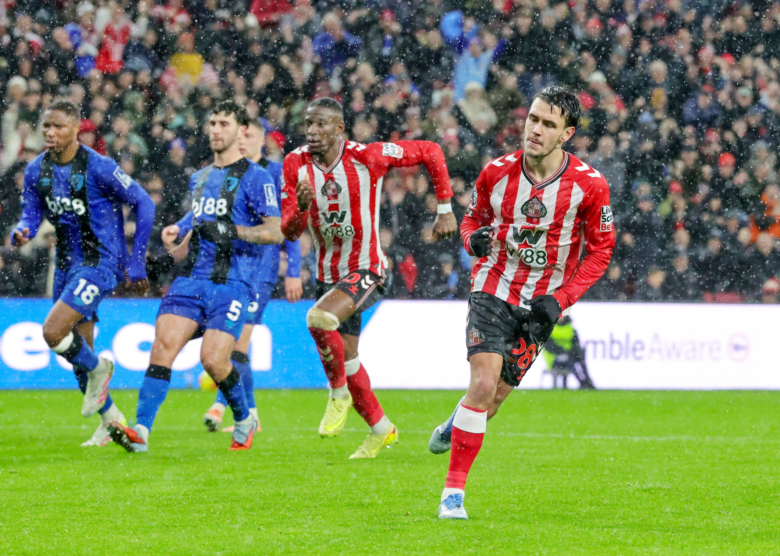
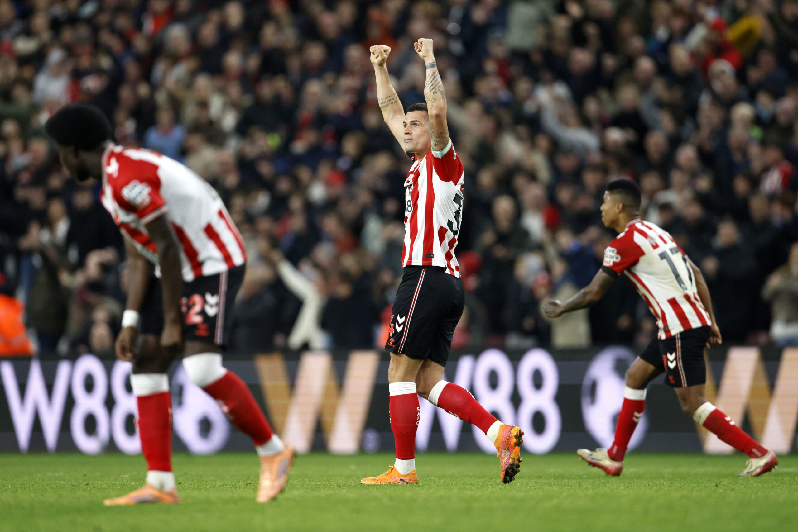
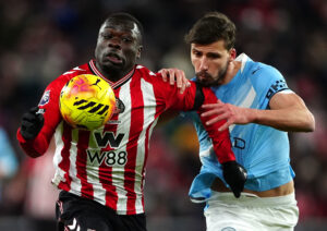
1st 2024/25: The first kit of the second hummel era became an instant classic on Wearside. Drawing inspiration from the Danish manufacturers’ first ever Sunderland kit, last season’s home shirt is simply perfect. From the hint to the ship logo sublimated on the red stripes, to the iconic chevrons all the way down the sleeves, this shirt struck a chord with supporters – and is made even better by its association with a promotion-winning squad. For me, it’s impossible to look beyond this.
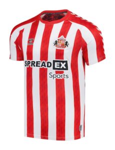
2nd 2007/08: There’s a theme here – whenever a manufacturer comes back to Sunderland, their first kit off the design pad always seems to be a cracker. Two seasons of really naff Lonsdale kits ensured that whatever Sunderland did next was always going to be better. And it was, as Umbro came up trumps with one of the best shirts we’ve had to mark our return to the Premier League in 2007 under Roy Keane. A simple, understated classic with complementary away and third kits, Umbro ensured we looked the part as we returned to the big time.
STEPHEN GOLDSMITH
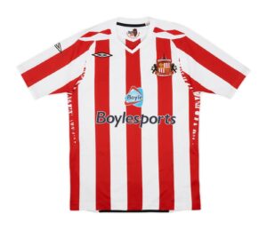
1st 2007/08: I rarely buy SAFC merchandise, a couple of t-shirts and training tops over the years is about it. I owned just about everything the club shop had to offer as a kid, but once I entered adulthood, for some reason, it just stopped. As an adult, I have only once bought an actual kit (or the top anyway). That was after being promoted under Roy Keane in 2007.
We had just come out of an era of absolute dog shit kits provided by Lonsdale. They were shocking, the away black one being the worst we’ve ever had in my opinion. For the return to the Premier League that year we switched to Umbro and the Boylesports sponsored shirt looked clean, classy and modern.
When I saw people wearing it in the summer sun, the red and white stripes looked the best they had in years and I fell in love with it. Such was the optimism around Sunderland and the Irish connection then, I decided to break the resistance and buy it. It remains the only top I’ve bought as an adult and I still have it, it’s in mint condition too.
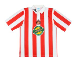
2nd 1997-1999: When Sunderland were relegated from the Premier League in 1997, we had a big, new shiny stadium to play in. The kit with that Lambtons logo on it seemed bold and nicely complemented the whole “new” Sunderland era.
The first season at the SoL was a rollercoaster alright, Peter Reid clinging on to his job before an uplift that saw us smash the 90 points barrier with ridiculously attacking football. Despite the points total, we’d miss out on the autos and have to settle for a play-off campaign. We all know what happened there don’t we? DON’T WE? We pissed the league the next season though!
When the attacking football started to click with Johnson, Summerbee, Gray, Quinn and Phillips, delighting crowd sizes I’d never dreamed of in this brand new stadium, it felt like peak football enjoyment. I often reflect back to that carefree summer of 97, the year I left school, and how it was the best I’ve ever had, and this kit takes me right back there. It takes me back to Sunderland blasting teams out the water on a weekly basis.
JON ELLENOR
1st 1997/99: This will always be my number one. Partly for the shirt itself – and partly for the football we played in it. The shirt had the Lambtons logo on the front, not just printed but stitched on with that fuzzy felt feel that made it stand out. The stripes were bold, crisp, and wide, and the addition of a proper collar gave it a kind of jeans-and-trainers wearability that made it more than just a football top.
But what truly cements its place at the top for me is the brand of football we played that season. 100 points. 100 goals. Super Kev on fire. The whole team was electric – it felt like we blew the league away. That week from 10th to 16th April – where we beat Huddersfield, Bury, and Barnsley – still lives rent-free in my head. Unbelievable football, and a team that just clicked.
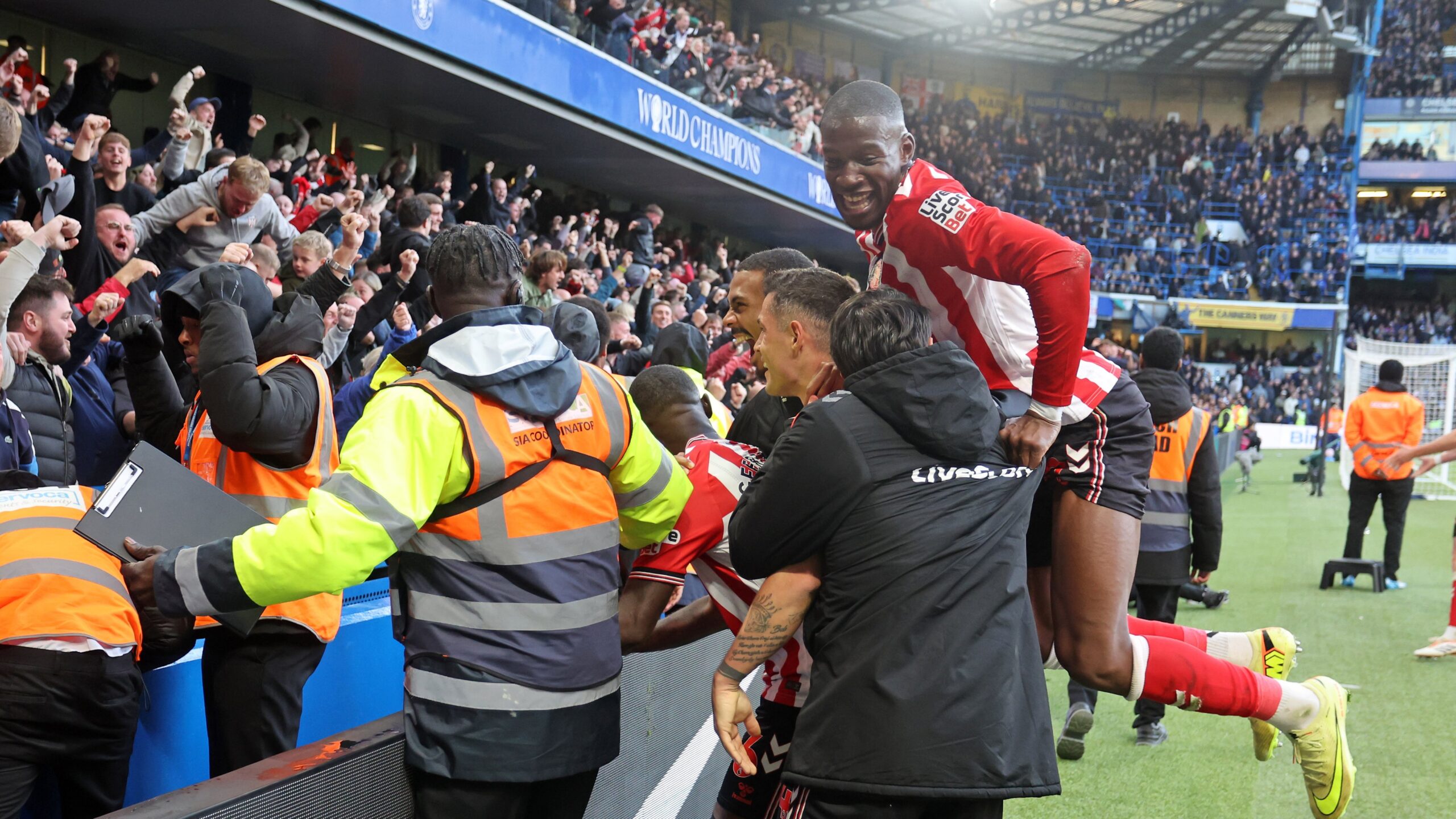
2nd 2024/25: How could it not? It’s a proper throwback – clean, classic, and instantly iconic. But more than that, it now holds one of the most unforgettable moments I’ve ever experienced as a Sunderland fan: Dan Ballard’s last-kick equaliser. I’ll cherish that forever. In 20 years, I’ll still be watching that goal back, remembering the limbs, the chaos, the roar. Shirts carry memories, and this one has a special place in mine.
ELEANOR MCCABE
1st 2024/25: If you’ve ever listened to me on a podcast or read anything I’ve written for WMS, my fondness for sentimentality won’t come as a surprise. For the rest of you, welcome to the ramblings of a deeply sentimental Sunderland fan (aren’t we all?) who ties every kit on this list to a core memory.
From the moment rumours of this kit surfaced, we knew it would be something special. It’s a truly iconic design, one that captures the spirit of the team who wore it and the unwavering love of the fans who lived every moment alongside them. I’ve always had a soft spot for kits that pay tribute to the supporters, and this one does so perfectly. Woven into its fabric, quite literally with the ship badge, is a beautiful blend of past and future.
Yes, we got promoted in this kit. Yes, it will forever be the one Dan Ballard famously couldn’t get off. But more than anything, this is the kit that marked Sunderland’s return, and for me, that makes it truly iconic.
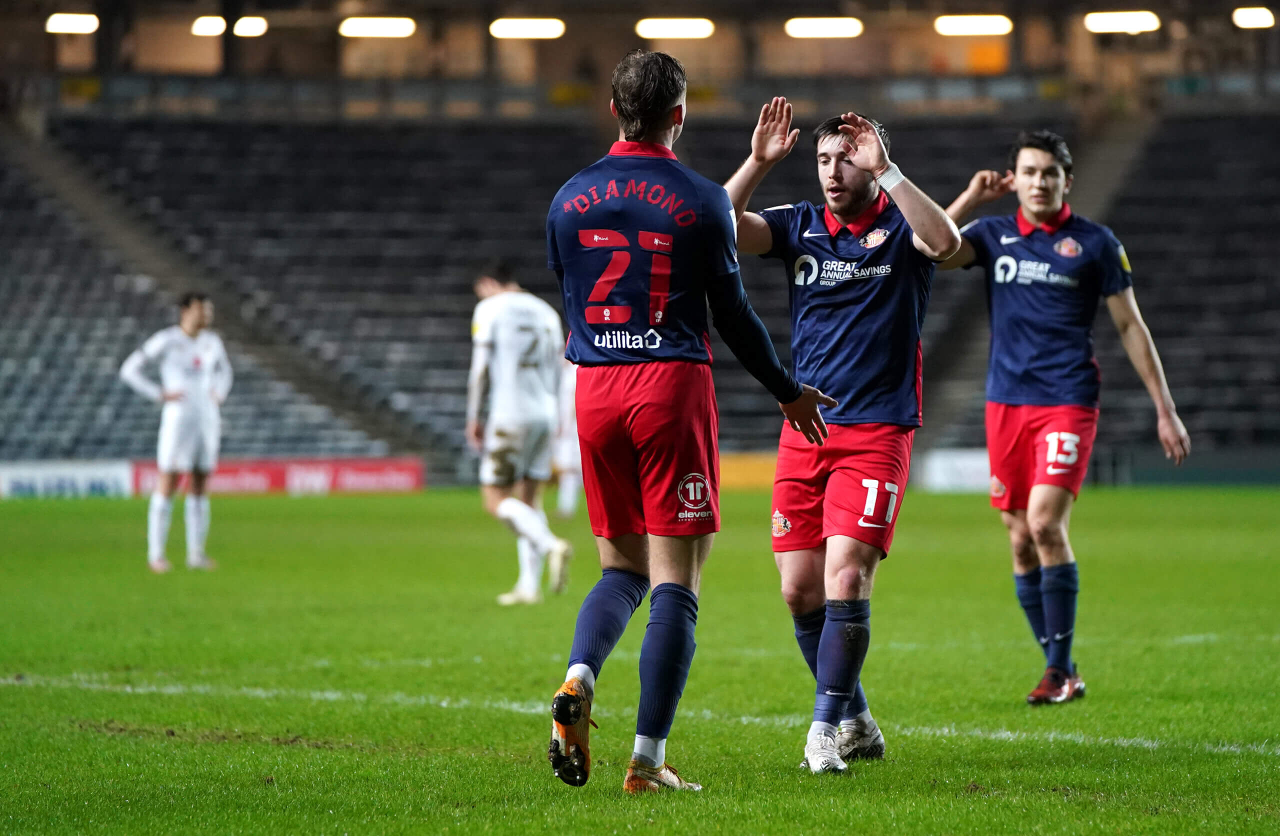
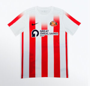
2nd 2021/2022: There are rare moments in football where time seems to stop, where everything else fades and all that matters is what is unfolding in front of you. We were lucky enough to witness so many of those moments during this season, all while wearing this kit.
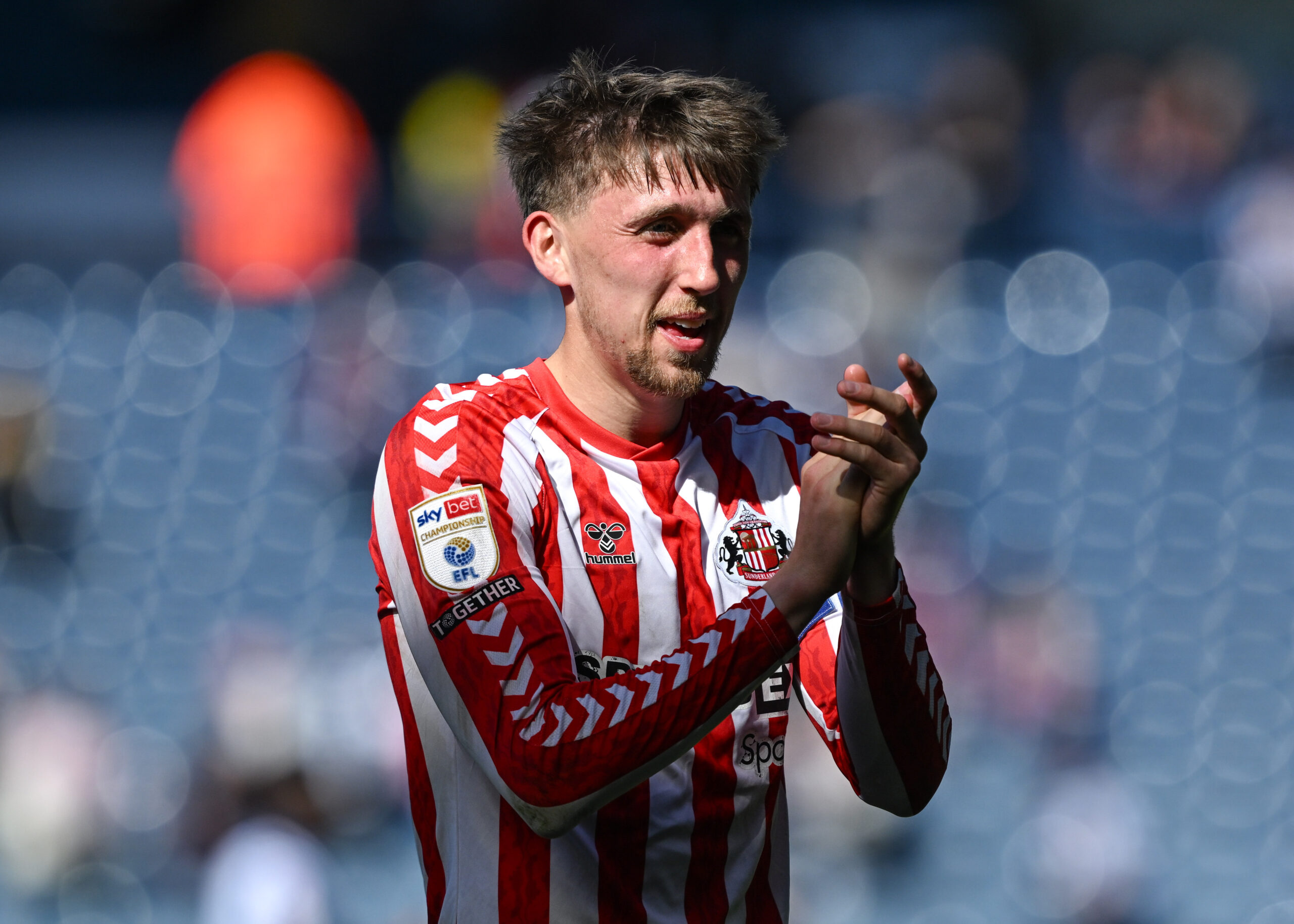
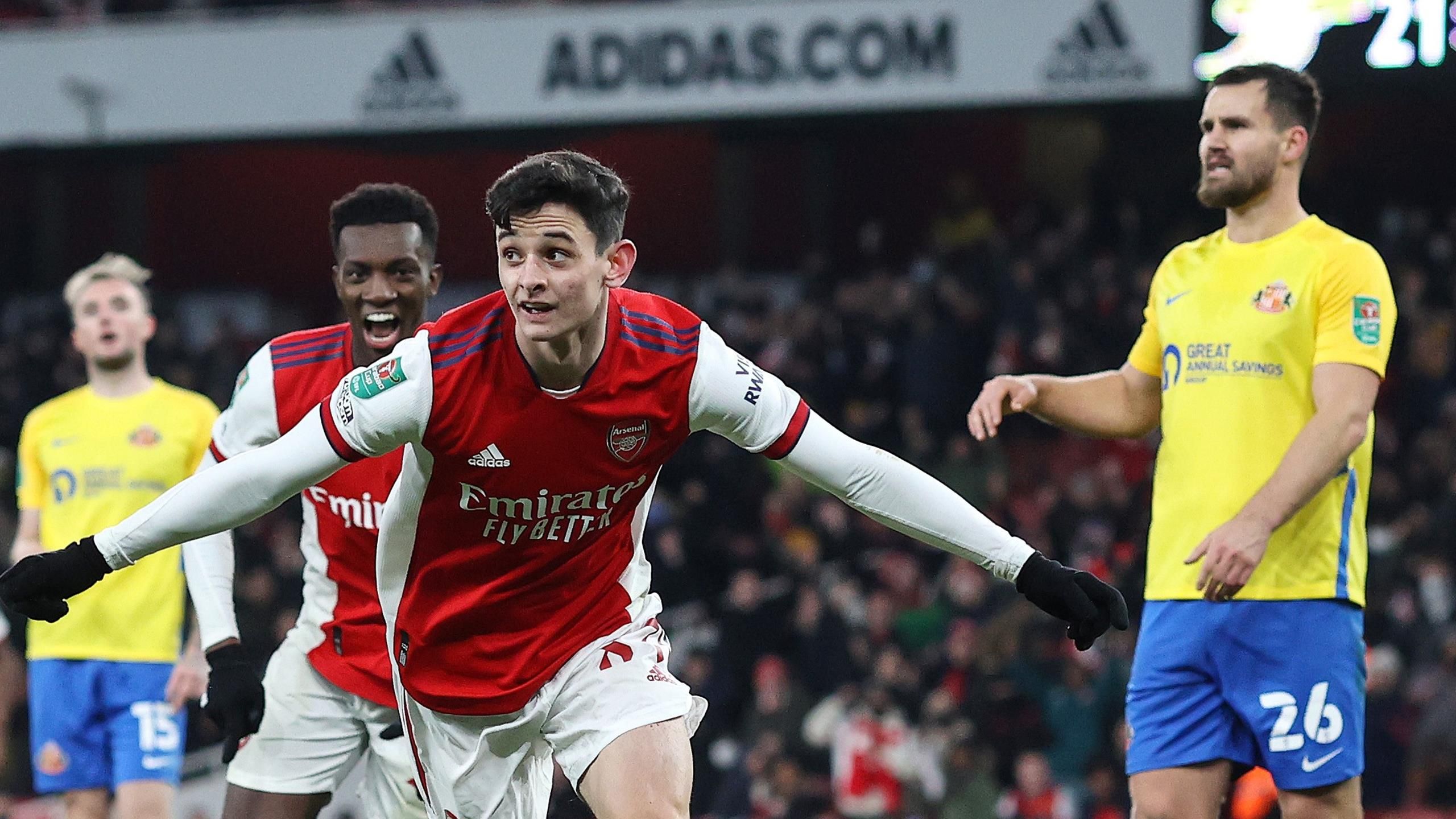
This was the kit worn when Ross Stewart put on a show week after week. When Patrick Roberts scored against Sheffield Wednesday to send us to the Play Off Final. My key moment? Elliot Embleton, wearing this very shirt, running towards the away end at Oxford after scoring an 89th minute winner. That moment, that goal felt like a shift, not just in the match but in the season.
We went unbeaten in the final 13 games of that season and every one of those moments, every goal, every tackle, lives in this kit. This kit is not just a reminder of promotion, it’s a reminder of how it felt to be part of it. The pride of following Sunderland, the hope. Looking back at the design now, it almost looks like its loading, pointing towards what’s coming next. Maybe it was an omen we all should have noticed sooner.
JIMMY REAY
1st 1997/99: Choosing between the 98/99 and 24/25 kits is nearly as hard as choosing between which season is my favourite as a supporter generally. In this instance, nostalgia for the season that cemented my love for this club wins out . The 98/99 kit just brings back so many amazing memories of 10-year-old me sat wide-eyed watching a team of red and white superheroes in oversized shirts scoring goal after goal after goal.
It’s the texture of it and how heavy it felt when I put it on and how excited I was to open the package. It’s travelling to the match on the bus from Durham with my Dad where we’re guessing how many we’re going to win by rather than wondering if we’ll win at all. It’s Nicky Summerbee’s balls in from the right with his massive shirt untucked, it’s Super Kev’s curlers into the top corner, it’s just pure noise and elation. That kit is just Sunderland for me. Unbeatable.
2nd 2024/5: As retro-inspired kits go, last season’s offerings have to be the best that any club has released. In my opinion it’s better than the original it was inspired by. So many little details on it, high quality manufacturing and one that would’ve been a collectors item regardless of how last season went. That it went how it did will cement it as one of, if not the iconic Sunderland kits in years to come and the decision to go back to Hummel has to be one of the best commercial movies the club have made in a long long time. Iconic.
JON LAMBERT
1st 1997-99: A nod back to the incredibly successful pre-war era with a return to an old badge, a baggy top and shorts, and a collar more accustomed to a rugby shirt. And a return to success it brung as this home kit delivered more home wins than any other kit during a free-scoring two seasons where Reidy’s men looked to score their way back into the Premier League.
When I think of this kit I think of Lee Clark, Allan Johnston, Nicky Summerbee, Niall Quinn, Super Kev (of course), and an honourable mention for Micky Gray bombing down the left. Across the two seasons we scored over 100 goals at home in the league alone and was a time where winning was expected. We looked the part and played the part.
2nd 2007/08: Not a memorable season on the playing front, however we did stay up, by a whisker. I always loved the kits that Umbro kicked out during the Roy Keane era. The narrow sleeves were perfect for a skinny Lambo with twiglet arms, and the shorts were a decent fit too. Kenwyne Jones is the player I gravitate to when thinking about this kit, as well as everyone’s favourite Danny Collins. This kit was the start of an era of sports betting sponsorship, which was a bit naff if you were junior-sized and wanting to look the part. It’s safe to say this kit has had many a five a side outing for me.
And the winner is….
1997/99 – 75pts

This was the first choice pick of three of the WMS team, and remained high enough in others’ rankings to promote it to a, let’s face it, deserved victory. A classic design taking hints from as way back as the 1930s, the first home kit of the Stadium of Light era brought us bang up to date with a new crest. The cotton weave material meant that this was a heavy old kit, but not for the heroes that wore it, as Peter Reid built an attacking side, culminating in a 105-point season. If the Stadium of Light was a fortress for those seasons, this shirt was the armour. Class.
2nd 2024/5 – 70pts
3rd 2007/8 – 50pts


